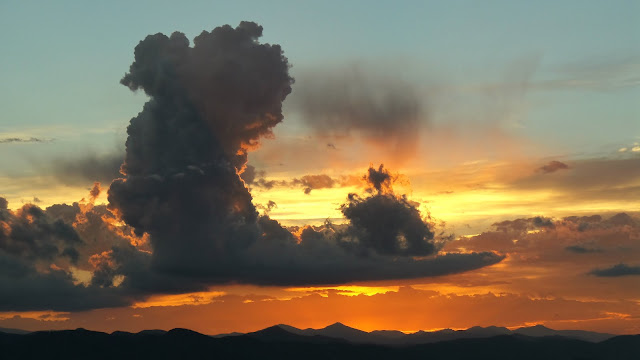
First off, apologies for this long-overdue post. I've had a busy month, and although I would have liked to post this within a few days of the beginning of 2016, I wasn't able to get it done until now.
2015 was a great year, and I think the images in this post will reflect that. In the previous year's image collection (click here to view), the images were only photographs. The image editing was restricted to cropping; I didn't need anything more. In this collection, though, I have drawings, CGI, and microphotography. These new types of images required more processing to prepare them for viewing. Of course, I used GIMP. I can't afford to pay for software.
Instead of listing tons of images, I picked out the most important ones. I also tried not to add the images from previous blog posts; the majority of what follows is new stuff. I also attempt to analyze the images from both a scientific and artistic standpoint.
Most likely, by the time most of you read this, you've already scrolled through the post and looked at most of the pictures. As the author of the blog, though, I'm not supposed to know that. In any case, enjoy!
The images are listed in chronological order (click to view large).
Less than two months later, I took this image of blooming lilac bushes. It has a nice combination of bright pink flowers and green foliage. The sky was cloudy, so the lighting is very soft.
This image is a close-up of lilac flowers and buds. While the main subject is exactly the same as that in the previous image, it has a very different feel. I took this image using my macro setup, which I introduced in an earlier blog post.
The photo also required some digital processing to improve the quality. The original had a high level of chromatic aberration; in other words, different frequencies of light were being focused slightly differently, resulting in rainbow colors around the edges of the ant and some blur. To fix it involved a complicated process which involved splitting the image into both RGB and HSV components. Not only is the weird color gone, but the image is also more focused (albeit a little darker in areas). As a bonus, I included the original to the left; click to view it large.
There's something about this scene, photographed in late May, that I really like. The white stuff is hail from a recent storm, and its low temperature cools the humid air below its dew point, causing a mist to rise up and drift in the wind. A low sun casts a golden glow over the whole scene, and if you look carefully, you can see rays of light in the mist. When I saw this, I had to get a picture.
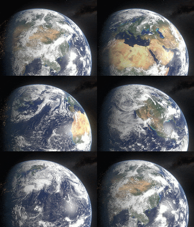
 Earth appears the size of a toy ball in this computer-generated image, made using Blender with post-processing in GIMP. This is the same model I used for my blog's background image (which I discussed in an earlier post).
It has an atmosphere (look closely), reflections on the water, a separate layer for the clouds (so they case shadows), and city lights on the night side. The model is very versatile - I've had a lot of fun with it.
This is an image of a chalk drawing I made. It's an anamorphic drawing, meaning it's distorted so that it can only be seen when viewed a certain way. It looks 3D when viewed from this angle. Making this drawing took time and careful planning with chalk. It was a fun challenge! You can read about this drawing and some others in an earlier post.
For this image, I put my camera up to a set of binoculars and used the combined zoom of both. The chromatic aberration is minimal, so I didn't need to use any processing in GIMP. The photo is in color, and you might see that the dark maria have slightly greenish and bluish hues. If you look closely, you can see mountains at the terminator (boundary between light and dark).
This is a drawing I made of the space shuttle. I wanted to make it as accurate as possible, and used a couple of references. I had to use multiple references, because in each one, a different part of the space shuttle was hidden from view. I could have forgotten the references altogether, but what's the point of drawing a space shuttle if your drawing isn't accurate?
The NASA logo was probably the most difficult detail to draw. It's the size of my pinky nail, and colored pencils can't be erased.
Fun fact: I used 7 colored pencils for this. Can you guess what they are? Hint: grey was not one of them!
I love the way the moon looks as an early crescent. Its position relative to Earth results in visible Earthshine, which is a glow on the dark side caused by light reflecting off Earth's surface. In this image, the pine tree adds detail which makes it much more interesting. Our planet is indeed a beautiful place.
This photo shows city lights shining through fog and snow. Their different hues show up in the sky, where the clouds scatter and mix their light. It took about 5 tries to get this shot; it required a 10 second exposure, which meant that even the slightest camera movement messed everything up. If I hadn't had a tripod, it would have been nearly impossible.
Last, but not least, I have this picture of newly fallen snow. This was another long exposure: 20 seconds. A couple of bright lights a few dozen meters away gave the snow a nice sparkle. Slight wind while the snow fell gave an interesting textured surface. I could analyze this more, but I think that would ruin the peaceful quiet of this photograph.
Not to mention it's almost dinner time.


These photos are gorgeous! I love the vibrant turquoise and orange combination with the cumulus cloud! And the picture with hail is just mystical! I think my other favorite is the geese, but the ant picture is really cool with the crisp pebbles in the concrete. I could say more on the rest of the photos which I also really like, but I'll stop now. Thanks for sharing these! your mama
ReplyDeleteStunning images. I use GIMP too; I found an excellent tutorial on using it to restore old photographs.
ReplyDelete